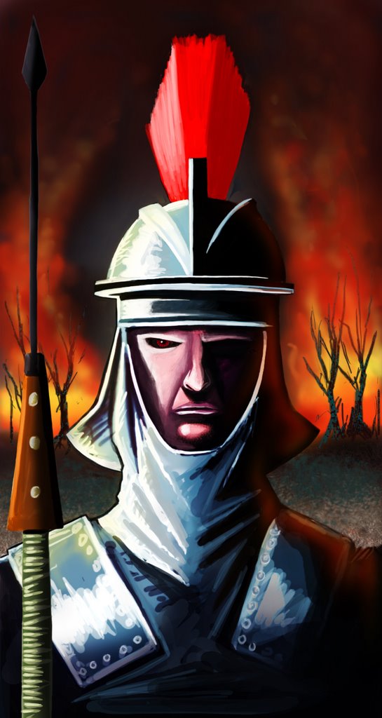
Hey ken, update looks good. The only thing I miss in this version compared to the last version is the reflected light on the helmet. Apart from that it's looking pretty good.
ok, ill try to touch that up. thanks vi.
Ya I like the first one the best. just enough fire. nice stern soldier
ya i like that one two.fuzz. i roughed that out in a hour 45 min. seems once i add more. some life gets lost.
Great stuff Ken! Awesome blog to boot!
AWESOME brilliant design!
Nice image! See usFrom spain ^^
Hmmm... he's shaped like a phallic symbol....even down his his wrinkly neck base. Gross, Ken!I like it.
Post a Comment
9 comments:
Hey ken, update looks good. The only thing I miss in this version compared to the last version is the reflected light on the helmet. Apart from that it's looking pretty good.
ok, ill try to touch that up. thanks vi.
Ya I like the first one the best. just enough fire. nice stern soldier
ya i like that one two.fuzz. i roughed that out in a hour 45 min. seems once i add more. some life gets lost.
Great stuff Ken! Awesome blog to boot!
Great stuff Ken! Awesome blog to boot!
AWESOME brilliant design!
Nice image! See us
From spain ^^
Hmmm... he's shaped like a phallic symbol....even down his his wrinkly neck base.
Gross, Ken!
I like it.
Post a Comment